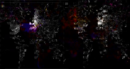
Geovisualisation
Discover how geographers bring a unique perspective to presenting data in innovative and understandable ways.
Find a geovis
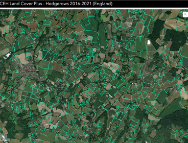
Mapping England's hedgerow landscape
Josep Serra Gallego, a Spatial Data Scientist at the UK Centre for Ecology & Hydrology, discusses the UKCEH Hedgerow dataset, aimed at guiding the planting and restoration of these vulnerable habitats.
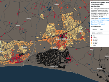
Mapping broadband speed and ultrafast availability
Oliver O’Brien, Senior Research Associate at University College London (UCL), discusses the Broadband Speed and Ultrafast Availability data shown on CDRC’s interactive mapping website.
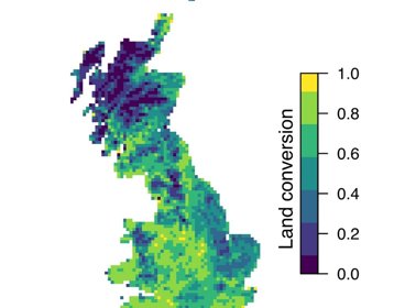
Mapping land-use change in Great Britain over the 20th century
Andy Suggitt and Alistair Auffret discuss how a chat over coffee led to them mapping and quantifying land use change in Great Britain from the 1930s to today.
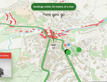
AI within a geospatial context
Steve Attewell has created an experimental map control system that uses hand gestures, voice recognition and artificial intelligence.
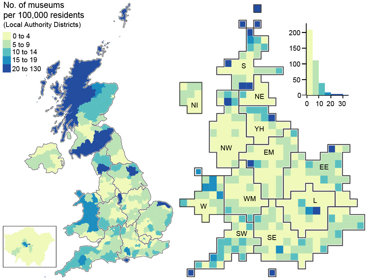
Mapping museums
Andrea Ballatore and Fiona Candlin used visualisations to better understand the spatial unevenness of the cultural sector across the UK.
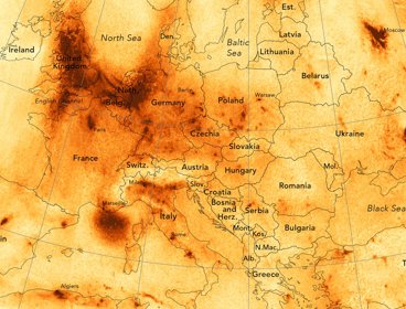
Air pollution in Europe
Discover how James Cheshire created this map displaying nitrogen dioxide levels across Europe.
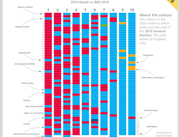
Voting patterns and deprivation in the UK
Learn how Alasdair Rae created this visualisation showing the link between voting patterns and levels of deprivation in the UK after the 2019 general election.
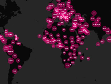
Mapping COVID-19
Andy Murdock describes how Maploom has created a visualisation which displays the evolution of the coronavirus (COVID-19) pandemic.
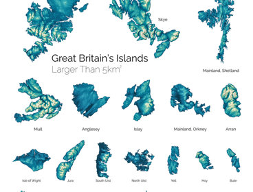
Great Britain's largest islands
Learn how Paul Naylor and his team at Ordnance Survey created this visualisation showcasing Britain’s largest islands.
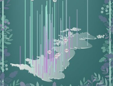
Britain's greenest city centres
We spoke to Dr Paul Brindley and Dr Jake Robinson about this visualistion showing Britain's greenest and least green city centres.
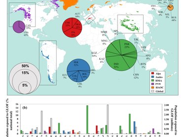
Mapping glacial lake outburst flood exposure
We spoke to Caroline Taylor, PhD researcher at Newcastle University, about this visualisation mapping exposure to glacial lake outburst floods.
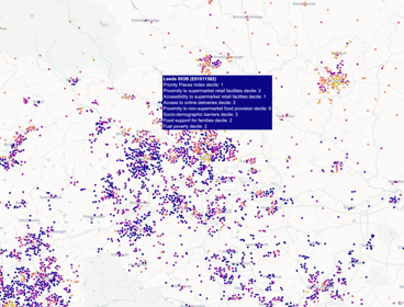
Priority places for food
We spoke to Peter Baudains about this visualisation displaying priority places for food.
Geography has never been more important in helping us to understand our rapidly changing world.
Geographers bring a critical perspective and approach to interpreting and presenting data. They help make new connections between different types of data by interweaving spatial methods with knowledge about our world, and finding innovative and understandable ways to present it.
In this series of images, we look at the power of maps and geographical data visualisations for telling stories about our world. We explore the ways in which connecting data on people, places and environments underpins good decision-making and improves communication and understanding. In the interviews with the creators that accompany each image, we showcase the skills, data, techniques and tools used to tell these stories, and the insight they can bring.
If you would like to suggest an image for the series, or would like to take part, get in touch at policy@rgs.org.
